Travvia - JUCY
Operating 3,000+ vehicles across 10 locations in NZ and Australia, the group includes JUCY (est. 2001) and Star RV (joined 2022). JUCY targets youthful, budget travellers, while Star RV offers a premium experience for 35+ inbound visitors seeking comfort and nature.
Lead UX UI Design
Auckland
Role:
User experience research/ Wireframes / Site mapping/ Design strategy/ Hi-fi Renders
Date:
Jan 2025 - July 2025
(6 months- Contract)
Jan 2025 - July 2025
(6 months-Contract)
Tools
UX Tweak/ Whimsical/Figma/UIZard/Storybook/
Asana/Sharepoint
Project overview
A UX research (URX) study assessed the current site’s accessibility, usability, booking flow, and user dashboard for booking management. Key issues were found in navigation and task completion, with clear opportunities to improve engagement and conversion. Insights now guide the redesign strategy.

A High-level plan that aligns user needs with business goals through thoughtful UXR, design & Strategy for JUCY Campervans website / My booking dashboard.
Project overview
A UX research (URX) study assessed the current site’s accessibility, usability, booking flow, and user dashboard for booking management. Key issues were found in navigation and task completion, with clear opportunities to improve engagement and conversion. Insights now guide the redesign strategy.

Project statement
Project Overview
JUCY Campervans needed a complete redesign of their outdated website and design system to resolve UI inconsistencies, poor user flows, and lack of integration with internal logistics. With no recent UX research and high drop-off in the booking flow, a user-centered, scalable solution was essential to improve usability, consistency, and conversion.
A UX research (URX) study assessed the current site’s accessibility, usability, booking flow, and user dashboard for booking management. Key issues were found in navigation and task completion, with clear opportunities to improve engagement and conversion. Insights now guide the redesign strategy.

Purpose, objective & goals
Purpose:
To design intuitive, accessible, and consistent digital experiences that meet user needs, drive business success, and future-proof our website.
Objective: Future-proof, user-centre website that drive engagement, conversion & brand leadership along with a dashboard for travellers to manage their existing or new bookings.
Goals:
• Understand & empathise with customers’ needs
• Align with business goals, increase conversion
• Improve usability issues
• Prioritise accessibility
• Ensure consistency
• Reduce risks and maintenance costs

Role & Responsabilities
As the Lead UX/UI Designer at JUCY, I drove all user research initiatives, including internal stakeholder interviews, A/B testing, card sorting studies, and collaborative workshops. I produced high-level research documentation to inform design decisions, redefined user flows, and led the wireframing and design direction across the project. My role involved aligning the user experience with business needs and laying the foundation for a scalable, user-centered design system.

Team & Stakeholders
The project at JUCY operated without a product owner, placing UX/UI at the center of strategic direction. It involved close cross-functional collaboration with marketing, development, data, and logistics teams. With low UX maturity, the work required autonomous execution, regular stakeholder alignment, and research-led collaboration to build consensus and drive design decisions.
The project at JUCY operated without a product owner, placing UX/UI at the center of strategic direction. It involved close cross-functional collaboration with marketing, development, data, and logistics teams. With low UX maturity, the work required autonomous execution, regular stakeholder alignment, and research-led collaboration to build consensus and drive design decisions.
Research & discovery
Research & discovery
Research & discovery
Initial Research & Methods
The methods selected for this research phase are designed to provide a holistic understanding of user needs, market positioning, and design opportunities. Each method contributes unique insights that, when combined, create a comprehensive foundation for the website redesign.
• Card sorting study > Navegation
• Card sorting workshop > Contents
• Preference study > Booking flow
• Competitor Analysis > 8 competitors
• Site assessment > Weakness, Strengths,
Opportunities , Treats, data performance & heatmaps.
• Industry UX UI Trends of 2025
• Feedback/Interviews > Personas by CX manager
Highlights
Highlights

Booking flow
Booking flow
Confusing, broken logic, lack of UI patterns or consistency, simplicity demanded. Base to base 70%, to UI solution opportunity.
Confusing, broken logic, lack of UI patterns or consistency, simplicity demanded. Base to base 70%, to UI solution opportunity.

Strategic paging
Strategic paging
Over 70 content pages to be classified into 3-4 Templates for dynamic content
Over 70 content pages to be classified into 3-4 Templates for dynamic content

Dashboard design
Dashboard design
Streamline dashboard UX fundamentals of accessibility and efficiency, backed by Previous CXR
Streamline dashboard UX fundamentals of accessibility and efficiency, backed by Previous CXR

Absent of Design principles
Absent of Design principles
Lack of design system, reflected on poor spacing, visual inconsistencies with typography and UI components
Lack of design system, reflected on poor spacing, visual inconsistencies with typography and UI components
Pain points
Pain points
Pain points

Booking flow
Booking experience, lacked: Flexible date selection and it’s logic was bringing extra and unnecessary decision making.
Booking experience, lacked: Flexible date selection and it’s logic was bringing extra and unnecessary decision making.

Home page UX - Low conversion
Home page UX -
Low conversion
Home navigation labelling was confusing and repetitive, long scrolling, Irrelevant content to NZ Zone.
Home navigation labelling was confusing and repetitive, long scrolling, Irrelevant content to NZ Zone.

Content density - Low conversion
Content density -
Low conversion
With over 70 pages of good content were hard to find without an strategic filtering UI and categorisation.
With over 70 pages of good content were hard to find without an strategic filtering UI and categorisation.

Lack of comparison
Vehicles were not able to be compare, users had to swap pages, making difficult to compare options.
Vehicles were not able to be compare, users had to swap pages, making difficult to compare options.

Not responsive - Low conversion
Not responsive -
Low conversion
The site had important CTAs such a check in user flows, missing on home page, when navigation was on mobile devices
The site had important CTAs such a check in user flows, missing on home page, when navigation was on mobile devices
Gap between CX/UI
Several user flows were missing for existing users who wanted to manage their booking or make multi-booking.
Several user flows were missing for existing users who wanted to manage their booking or make multi-booking.


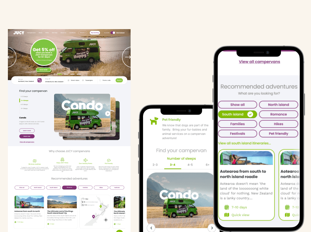
User flows/Wireframes
Project title
To ensure brand consistency and scalability, we developed a reusable component library grounded in atomic design principles. This library included typography, color schemes, buttons, forms, icons, and custom components for real-time chat and auction interactions, promoting a cohesive visual identity across all features.
Turners Automotive Web Application Design System
Design System/ Renders
Key outcomes
High-fidelity prototypes were essential to demonstrate how the user flows would feel in action. I created detailed prototypes for all critical interactions—such as finance management screens, the buy-now checkout, and the auction bidding process. This enabled stakeholders and users to interact with the design and provided valuable feedback.
Enhanced user engagement, improved accessibility, reduced development time, and consistent UI across multiple interactive features. This cohesive design system helped users quickly navigate complex workflows and enhanced platform scalability.
Aftermath
Aftermath
Aftermath
User flows/Wireframes
To ensure brand consistency and scalability, we developed a reusable component library grounded in atomic design principles. This library included typography, color schemes, buttons, forms, icons, and custom components for real-time chat and auction interactions, promoting a cohesive visual identity across all features.
This case study followed a strategic approach to user experience research, combining quantitative and qualitative insights to uncover why the conversion rate sat at just 1.2%. Through seven research methods, including customer interviews, analysis of legacy personas, stakeholder goals, competitor benchmarking, and collaboration with the data team, we identified key usability issues in the booking flow, site navigation, and overall engagement.
A comprehensive report was delivered to stakeholders, outlining findings, documented design processes, validated user flows, and foundational wireframes. A Figma token system was also established to support scalable design. While key deliverables were validated and approved by the CX team and supported by UX research via UXtweak, the project stalled before implementation due to leadership misalignment, lack of product ownership, and limited developer resources and budget.
Design System/ Renders
High-fidelity prototypes were essential to demonstrate how the user flows would feel in action. I created detailed prototypes for all critical interactions—such as finance management screens, the buy-now checkout, and the auction bidding process. This enabled stakeholders and users to interact with the design and provided valuable feedback.
Together, we can craft your next breakthrough.
© 2024 Vic Burneo Design
Together, we can craft your next breakthrough.
© 2024 Vic Burneo Design
Together, we can craft your next breakthrough.
© 2024 Vic Burneo Design
Together, we can craft your next breakthrough.
© 2024 Vic Burneo Design